Paper bag guide
Kraft vs White Paper Bags
How brown kraft, white and recycled-look paper print, feel and suit different shops
What is the real difference between kraft and white bags?
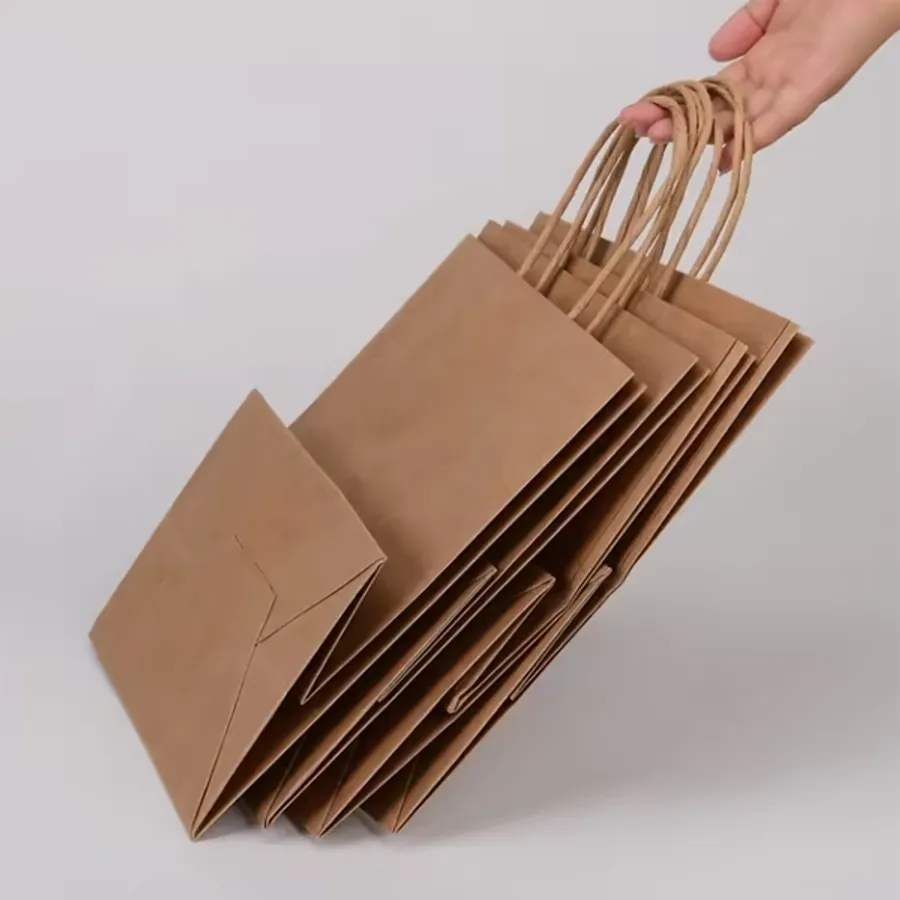
Both are kraft paper, which is a strong paper made for bags and wrapping. Natural brown kraft keeps its brown color. White kraft is the same family of paper, made white.
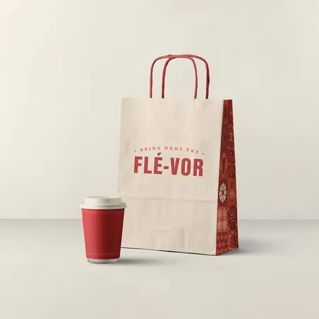
On the counter, the difference is mostly about look and print. Brown kraft feels plain and practical; white kraft feels clean and bright.
Strength and feel are close when the weight is the same. A 120 gsm brown bag and a 120 gsm white bag carry and fold much the same way.
Price is close too, though not always identical. Ask for both on one quote if the difference matters to you.
The choice really comes down to your logo, your colors and the impression you want the bag to leave. The rest of this guide walks through each of those.
Brown kraft, white kraft and coated white compared
Coated white art paper is a third option many buyers weigh against the other two. Here is how the three compare on the points buyers ask about most.
| Point | Natural brown kraft | White kraft | Coated white art paper |
|---|---|---|---|
| Surface | Matte, slightly rough, visible fibers | Matte, smoother, even white | Smooth and sealed |
| How colors print | Darker and softer than on screen | Close to the true color | Sharpest and most vivid |
| Best artwork | Bold logos, one or two colors | Full color, brand palettes | Photos, fine detail, lamination |
| Scuffs and marks | Hidden well | Show more | Show on dark prints |
| Common finishes | Uncoated | Uncoated | Matte or gloss lamination, foil, spot UV |
| Typical bags | Grocery, takeout, everyday retail | Cafés, bakeries, bright retail | Eurotote, rope handle and luxury bags |
How does ink look on brown kraft?
Ink on brown kraft is not printed on white. The paper color shows through, so every ink shifts darker and warmer.
Black, navy, deep red and dark brown look strong and crisp. Mid tones such as orange or teal look muddier than on screen. Pale colors such as yellow, pink and light blue can almost vanish.
Kraft fibers also soak up ink, which softens fine lines. Text under about 8 pt and thin script fonts can blur on rough kraft.
Full color (CMYK) works on kraft, but expect a vintage, toned-down result. That can be lovely for a rustic brand; it can be a shock for a brand built on bright colors.
Your proof is the real test. Ask for one version on kraft and one on white, then compare them side by side before you choose.
Our custom printed paper bags page shows how one and two color logos sit on both papers.
Can you print white ink on brown kraft bags?
Yes, and it is one of the most popular choices we quote. A white logo on brown kraft looks bold and modern, and it reads from a distance.
White ink is an opaque ink laid on top of the brown. It suits simple shapes, wordmarks and line icons more than detailed artwork.
You can also combine white with one dark ink, which gives a two color look without full color cost. A white logo with a black web address underneath is a common two color layout.
If your brand color is light, white ink is often the best way to keep the logo visible on kraft. The proof will show how it sits on the paper.
For a standard kraft bag that takes white ink well, see our kraft paper bags with handles.
What does white kraft do better?
White kraft shows colors close to how you see them on screen. If your brand uses a specific blue, pink or purple, white is the safer base.
It also handles full color artwork, gradients and small text better than brown. Menus, patterns and photos look cleaner.
Food businesses like white for another reason: it looks fresh and clean next to pastries and sandwiches. Pharmacies and clinics like it for the same calm, tidy look.
The trade-off is that white shows marks. Scuffs from a stockroom floor or a grease spot from a pastry stand out more than on brown.
See sizes and handle options on our white paper bags page.
When should you step up to coated white paper?
Coated art paper has a smooth, sealed surface. Ink sits on top rather than sinking in, so colors look richer and fine detail stays sharp.
It is the base for laminated bags. Matte lamination gives a soft, velvety feel; gloss lamination gives shine and deeper color.
Foil stamping, spot UV and embossing also work best on coated paper. Those finishes need a smooth surface to look crisp.
Coated bags are heavier, commonly 157–210 gsm, and they cost more than kraft. Most stores use them for premium or gift sales only.
See how coated paper is used on our Eurotote shopping bags.
What is recycled-look kraft?
Recycled-look kraft is a paper finish with visible flecks and a slightly uneven, oatmeal tone. It looks handmade and earthy.
We describe it by its look only. It is a finish choice, chosen for appearance, and we make no claim about what the paper is made from.
It suits brands with a craft or farmhouse style: candle makers, soap makers, coffee roasters and farm shops. Simple one color logos in black or dark brown look best on it.
Expect a little more variation from bag to bag than with plain brown or white kraft. That variation is part of the look, so do not choose it if every bag must match exactly.
Plain bags in this finish work well at craft counters, and our brown paper bags come in it too.
Can one brand use both kraft and white bags?
Yes, and many do. The trick is to keep the logo, layout and type the same, and let the paper change with the job.
A café might hand out white pastry bags at the counter and brown kraft carryout bags for bigger orders. A gift shop might use brown kraft every day and white bags for weddings and Valentine's Day.
Choose one ink that works on both papers. Black is the safe pick. A dark brand color also works if it holds up on brown.
Is your main color light? Print it on the white bags and use white ink on the kraft ones. The logo shape carries the brand even when the color changes.
Order both papers on one quote. One proof per paper shows you exactly how each will look before anything is printed.
Which businesses pick kraft, and which pick white?
There is no rule, but patterns show up in the quotes we write. Here is what we see most often.
- Grocery stores, delis and farm stands: brown kraft, one color.
- Restaurants and takeout: brown kraft for outer bags, white for sandwich and pastry bags.
- Bakeries and cafés: both, with white for bright branding and kraft for a rustic counter.
- Boutiques and gift shops: brown kraft with white ink, or white kraft with color.
- Cosmetics, jewelry and fashion: coated white or black paper with foil or lamination.
- Candle, soap and craft brands: brown or recycled-look kraft.
How to choose between kraft and white for your bags
If you are still unsure, test your artwork before you commit. The Design Your Bag preview page lets you place your logo on real bag photos first.
- Look at your logo colors. Light or bright colors point to white kraft or white ink.
- Check your artwork detail. Fine lines and photos point to white or coated paper.
- Think about the setting. Rustic counters suit kraft; clean, bright stores suit white.
- Decide on finishes. Foil, spot UV or lamination need coated paper.
- Ask for both papers on a single quote to see the price difference.
- Approve the free design proof, which shows your artwork on the paper you chose.